
Hoardings are the huge boards that we see lined up along flyovers and big construction sites belonging to certain companies advertising their products/services. They are capable of grabbing our attention even from a distance. This is because of their enormous size and unique design.
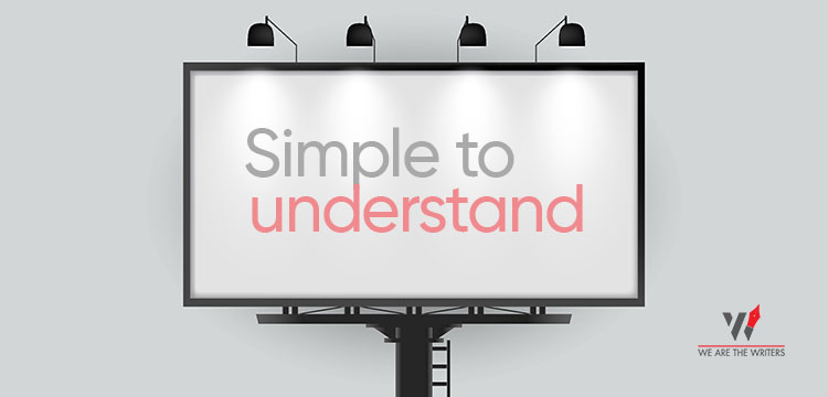
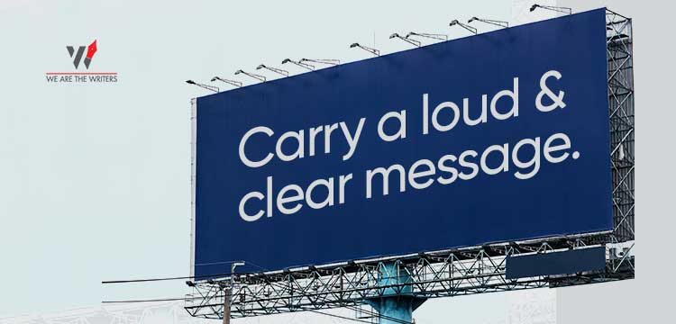
Hoardings are an excellent way to attract people’s attention in an unconventional way, by displaying massive advertisements that are:
- Simple to understand
- Carry a loud and clear message.
On a daily basis, thousands of motorcyclists, truck riders, pedestrians, and outdoors/sports enthusiasts pass by hoardings.
Most people get confused between the two terms: billboards and hoardings.
Wait, are they the same thing? Not really.
There is a slight difference between the two.

1. Billboards are used to advertise a company’s goods or services in order to market them to the general public. The majority of them are digital in nature.
2. Whereas, hoardings are promotional boards used by a company for display advertising. They are mainly seen in congested areas of the city, alongside flyovers and on highrises under construction, where they will be seen by the greatest number of people.
A successful hoarding design is defined by some key areas of importance.
They are as follows:
- The hoarding design should be large enough for the people to see even from a great distance. Make sure that the text and fonts used are large enough to be seen by passing cars and busy pedestrians. Keep in mind that even the best hoarding design is worthless if it is difficult to read from a distance.
- Always use images that convey the message about your company/brand clearly. The power of an image outweighs the power of words. Use high-quality images in your hoarding design so that visitors can get a sense of your brand and service just by looking at the picture.
- Colour contrast is often valued because it is noticeable and appealing. If the hoarding board is white, for example, use a font that is red, black, blue, or some other dark colour. These types of high-contrast colours will add to the overall appeal of your hoarding.
- Make your hoarding design simple. Avoid unnecessary clutter. Too many elements in your hoarding design will drown the main message and people will overlook it easily. Include your company logo, the main message and some important imagery in a comfortably spaced out format in the hoarding.
- In your hoarding style, use bold, non-serif fonts. Avoid fonts that are decorative, italic, or serif fonts. In general, sans serif fonts in upper and lower case are the easiest to read. The larger the font, the better for displaying your material on hoardings. The most popular fonts used for headlines on hoardings and display advertisements are Arial, Calibri, Verdana, Tahoma, and Helvetica.
For years, people have used hoardings to market their products. It is, in reality, one of the oldest marketing techniques, and it falls under the category of outdoor marketing, which benefits companies of all sizes.
The ability of hoardings to advertise locally has been recognised by global, foreign, and local businesses.
 WhatsApp