Infographics are the visual representation of any data or information. Many brands majorly use infographics as social media posts. They are used to present the research data and other information as well. They can also be used for educational purposes. Infographics are preferred to communicate information more than texts. It is because human brains can understand and process visual presentations much easier than texts. Since they can be easily understood, infographics are used a lot.
There are many types of infographics. Some of them are list, comparison, how-to and many more. Based on the concept of infographics the type is chosen. Infographics can be designed in graphic designing software. You can be as creative while designing an infographic. But make sure that it clearly explains the information. There are some trending designs of infographics that will be loved by many. In this article, we have listed the infographics trends that you must try in the upcoming year. We have also added some infographics examples to help you out.
You may also read our blog:
26 Best Graphic Design Software
How to Become a Graphic Designer ? Qualifications, Jobs and Role
Table of Contents
Playing with Colors
Pablo Picasso stated that colors can have an influence on moods, feelings and emotions. There is a stream of study called Color Psychology. It deals with the emotions associated with colors. Not only it bright colors like Green, Yellow and blue will grab the attention so faster. That is the reason why brands use these colors for marketing-related posts. This psychology of colors will be used by many organizations to make people feel the emotion behind information deeply. This is been one of the successful techniques that are followed in 2022. And the trend is here to stay for the next year.
Make infographics using saturated and vibrant colors. More than subtle tones, saturated tones will be noticed easily. Thus, saturated colors will make your infographics trendy.
Some of the infographics examples are,
Food based infographics
Orange, Yellow and Red are the colors that will induce the appetite of human beings. Prefer these colors if you are making an infographic for food-based information especially non-vegetarian. For vegan and vegetarian foods you can use green. Green depicts nature, so it will match the vibe.

Comparison based infographics
If you are comparing two things, differentiate those with vibrant colors. It brings vibrancy to infographics and makes them look great.
Animations
Animations will keep the audience engaged. Hence animations will be one of the best infographics. When you hear this, do not think that making this kind of infographic is going to be difficult. Small animation effects like Sliding texts, zooming images and moving bar charts is enough. But if you can do more than this, go ahead. Keep in mind that the content that you insert must be understandable. Concentrate on understandability first and then on animations.
Some of the infographics examples are,
Statistics
While making a statistical infographic, try incorporating effects into it. A bar chart where the results will be shown as increasing or decreasing bars. This will keep the audience engaged.
Flow charts
Procedures are usually explained in flow charts. Steps can appear one by one with some transition effects. This will be more interesting than a normal flow chart infographic. This will eventually increase the engagement of infographics.
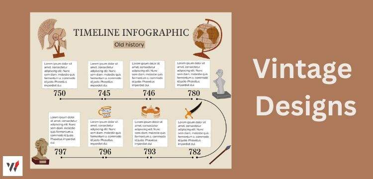
Vintage Designs
Bygone-era designs are making a huge comeback in almost all fields. The nostalgic 80’s and 90’s designs are here to make an impact. Some 2D cartoon characters, colorful elements and black and white visuals will be a trend. Involving many bygone elements like the telephone and vintage cars can make the infographic perfect. This can be personally connecting to the millennials.
Some of the infographics examples are,
Healthcare instructions
Vintage styles is been performing quite well when it comes to healthcare instructions. Instructions to prevent Influenza, with block letters using fonts Wilden. It can also have 2D cartoon images, block colors and designs.
History based infographics
Using vintage styles for explaining history is the best thing ever. Take any historical event and explain it by adding black and white vintage elements.
You may also read our blog: Find 6 Simple Steps on How to make an Infographic ?
Personalization
This will not apply to almost all fields. Apps, software and websites can use this trend. Giving information about the user will be the trend. You can add his/her name. Call her/him a friend or sibling. This will help you bond with the audience on a personal level.
An example of this trend is,
Year Review or Month Review
We have seen YouTube and Spotify making song review kind of infographics this year. The infographic listed all the songs that the user has heard. It also included information like the most-heard songs of the year. It will let users know about themselves. It can also be done month-wise. For brands or e-commerce websites you can provide details about the most purchased or most viewed items in the form of an infographic.
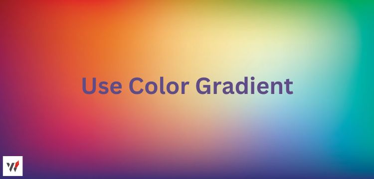
Using Colour Gradient
A gradient is a gradual transition from one colour to another colour. These gradients make the infographic looks very sleek and professional. It is yet another great way to impart colours to your infographic. Gradients are the smallest details that will make a huge difference in the outcome of the infographic. One common mistake that most people do is to overload the infographic with numerous gradients. Just add a gradient effect to the background. Or make the texts or the background of the text have gradient effects.
Some infographics examples,
Title backgrounds
Gradients in the title backgrounds can make it look good. You can try a light colour to dark colour transition for this.
For certain texts
You can use a gradient background for certain texts. This will make it stand out.
Using Lines
This year is going to give you all the freedom to play with lines. You can use arrows, dotted lines and many more lines in a creative way. Using colourful lines with some degree of transparency is also preferable for backgrounds.
Infographics examples using lines are,
Timeline based infographics
While making an infographic that will include the history of a company, you can use lines. Just create a flowing line. You can add some gradients, textures and other visual elements to the line. Take a point and mention a year and the information related to it. After that take another point and mention another year and information. This can turn out great.
Flow charts
Flowchart-based infographics involve many lines. You can make the flowchart look more interesting by using the lines in a creative way. Instead of a straight line, you can go for lines that are slightly curved. If you are making a professional infographic then need to keep it simple and sleek. If it is entertainment based. Then there are no boundaries.
Get Artistic
This era is all about grabbing the attention of the post. Ever since social media has become a heavily competitive place. Almost all companies are hiring a highly skilled graphic designers. So that they can create good infographic posts to get attention. But more than anything, being artistic while conveying good information will be one of the best infographics trends. You can get as artistic as you can, and add some animations and colours to make the post look great.
An example is,
Using Mandalas
Nowadays Mandala designs with animations are very popular. Instead of a normal pie chart Mandalas are being used. The core will have a color that will denote information. Likewise, each layer can be given a colour and can denote certain information. This kind of design will make the infographics looks very different and unique.

Play with Fonts
Trying different fonts is going to be an infographic design trend. Not only trying different fonts. Adding a creative touch to the letter is going to be welcomed. You can express yourself with the way the letter is written. This will give a unique touch to the infographic. Since we all use only 7 to 10 fonts most of the time. Bringing new style letters will grab the audience’s attention. Make sure to not go overboard with playing, as it can make the texts unreadable.
Some infographic examples are,
For Titles
Usually, the title is given in bold capitalised fonts. But you can try adding Capital letters in the middle of the word. You can flip and use mirrored letters as well. Make one letter in wiggle fonts. This will amp up the aesthetics of the entire infographics.
Use Ukiyo-e Style Painting
Ukiyo-e is a Japanese style of painting. It is a flat painting. It was a famous style in during Japan’s Edo period. It is making a comeback now. Especially for social media posts, this can be a great style to follow. This kind of painting is usually used in school books. Hence it can be a great trend for educational-based infographics as well. You can create clean designs in this style, which can make the infographics template look sleek and attractive.
For example,
Fashion based infographics
This Ukiyo-e style suits best for fashion. Fashion industry infographics are all about explaining a particular type of clothing and ways to style it. Sketching the designs in the Ukiyo-e style can be a win for the fashion industry.
Doodles
Doodles are scribblings. They do not have any rules, shapes or meanings to them. People just take a pencil or paper and then scribble free-handed. No one has ever imagined that it will a trend. But it is now. People do not put much thought when doodling and that is the beauty of it. Normal people will relate to doodles more than normal texts and other visual elements. Infographics can also incorporate doodles to make them more attractive.
Infographics example of this trend is,
Using doodles in the background and corners
Doodles can be used in the corners of the infographics. It can also be used in the background. You can choose a different shade from the same color family. Or choose a contrasting color as well. Make sure that the text and doodle are not overlapping to avoid confusion.
Anti-Designs
Anti-designs are rustic and rugged designs. They do not look soft and cute. They involve bold fonts, saturated colours and contrast colours usage. This type of infographic is slightly congested in design. But the information will be clearly understood. This will be one of the trends.
Some infographics examples
Fashion industry
Information on Bohemian styles of clothes or edgy clothing will look amazing when anti-designs are incorporated into it. You can make an infographic on how to style a bohemian dress differently.
Gaming
Infographics based on gaming especially battle-based games like PUBG, GTA and many more will look great with anti-designs.
Patterns
Patterns are one of the appealing visual elements. It is going to be a trend this year. Patterns are something that will stay in trend. Usually, the background will have a solid color. Adding a pattern to the background will break the monotony and make the infographic look attractive. Waves and geometric patterns are very popular. Patterns are more suitable for marketing and software-based infographics.
Some of the infographics examples are,
Marketing infographics
Adding wave patterns to marketing-based infographics is the best thing to do. If your infographic explains technical information, then add some patterns to the background. The pattern color can be contrasted with the background color. This will make the infographics look more professional.
Software based infographics
Infographics that are explaining the software may have some geometric patterns in the background. White and blue can be a great color combination for this.
Maximalism
Keeping it minimal can make the infographic look pretty but maximalism can make it trendy. Maximalism is adding many visual elements and saturated colors. Keep in mind that it should also be readable. If you are trying this trend, go for information that will not demand you to add a lot of text. Because too much information with maximal designs can make the audience overwhelmed.
Infographics examples are,
As a background
Adding so many colors and visual elements in the background of any infographics is a better idea. The fonts written on it can be white or black. This will make the infographics trendy as well as readable.
Political infographics
Infographics that explain political information will look catchy when many visual elements and colors are added to them.
Adding Grungy Elements
As we see many bold designs are getting trendy, and grunge is not going to stay back. Adding some scratches and textures. Making the infographics look a bit old and dusty is going to be a trend in 2021.
For example,
Speaking about old objects or cars
You can add grunge elements to the infographic that explains the features or history of old cars. Adding grunge elements will add to the overall look of the infographic.
Conclusion
Representing information or data visually is called infographics. Infographics are very easy to read for human minds. As human brain process visuals much faster than texts. Best Infographics are a great way to grab the audience’s attention. There are many types of infographics. Some of them are list, comparison, how-to and many more. Based on the concept of infographics the type is chosen.
Infographics can be designed in graphic designing software. You can be as creative while designing an infographic. Trends occur in almost everything. Based on the audience’s liking and special events trends change often. Likewise, every year there will be some new trends in infographics designs as well. In this article, we have discussed the trends along with examples of infographics.
FAQs
- What are infographics?
Infographics are visual representations of information or data.
- What makes an infographic successful?
A successful infographic must have the following characteristics,
- Tell the information in a comprehensive way.
- Have minimal texts
- It should be well-designed.
- What are the elements that are used in infographics?
The elements that are used in infographics are,
- Text
- Icons
- Illustrations
- Data widgets
- Shapes
- What are the uses of infographics?
The main uses of infographics are,
- Make people understand complex content.
- Increase brand awareness.
- What is the average size of infographics?
It depends on the shape. But almost all infographic will be between 600 to 5000 pixels.


 WhatsApp