In order to make the most out of it, your content strategy should have rich media to complement your content. Rich media includes images, videos and infographics.
In this blog you will find out what an infographic is and why you should add it in your content strategy right away.
Table of Contents
What is an Infographic ?
The infographic definition explains it as a visual representation of useful data along with an image. an info It also combines different elements of text, image, chart, diagram, a recent video, etc that ensure better understanding of the content to its consumers.
It can be effectively used for data presentation because it has the quality of simplifying the complex information. It enables the customers to decipher the crux of the content in a better and easier manner. an infographic is one of the the best rich media to use in your content.
An infographic can also be called the visualization of a story. It has become alot popular lately. It’s one of the examples of rich media because it complements the content and adds a new texture to the overall content, all the while having new knowledge. Newsrooms tend to call them the ‘Umbrella’ of their editorial design as they are extensively used in news content.
An infographic is the amalgamation of visual and text language. It is the most easily understandable form of visual storytelling. Both the languages are extremely dependent on each other, so much so that it’s impossible to generate an infographic without the two.
Not only this, infographics have even made their cut in data storytelling and journalism because of the crisp manner that they can offer useful information. It’s the easiest alternative to lengthy and complex narratives that are vastly prevalent on the web these days. It is not limited to only these fields of work, because of the power to explain complex narratives easily it has found solid ground. It’s a powerful tool for communication in various sectors such as education, government and business.
Types of Infographics | What is an Infographic
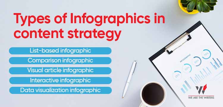
There are different types of infographics that can be used with various types of content and how the audience sees them.
1. List-based infographic
The main content in this type is in the format of a list. It’s basically used in the data that is best defined in a list. Guides, steps, hierarchy or just different parts, all of these types of data can be accounted for in a list based infographic.
Usage:
This type is used with the content that is lengthy but important as well. It’s best for using when there are important points that have to be given equal priority. There are sub-headings that make the whole passage easy to read and also prove knowledgeable.
2. Comparison infographic
Remember how you used to differentiate 2 topics in the exam answer sheet. This is that type of infographic. It is used to list similarities and differences. It is brief and clear cut data about 2 or more things where the audience can draw a comparison as soon as they consume it.
Usage:
Use this type of infographic when you have to list pros and cons, benefits and limitations, etc. Simple comparison of among things can also be done by providing a basis of difference.
3. Visual article infographic
The ratio of visuals in the infographic is more than that of the text. The image is more prominent than the text content. This type of infographic lets the audience do the thinking, more than providing context with text.
Usage:
Read about visuals for content : All about UI UX | Learn to make your Content Design better in 2022
It would be great to use this type when you have an article or any textual aid. The image will add variety to the content and both will be complementary to each other.
4. Interactive infographic
This is the richest in this type of rich media. It has everything, from charts to graphs and questions. It gives a prominent amount of information with the use of such media and the audience can look upto anything that strikes a chord with them. Most infographics fall under this category.
Usage:
Use it in the times of time crunch. These are best suited when the aim is to provide a cohesive knowledge which is brief enough and is able to provide useful information in no time. Millennials and Gen-Z are considered as the target audience of this type of infographic.
5. Data visualization infographic
Visualization of data is considered a good practice because it adds to the credibility of the data. Simple data analysis can be monotonous sometimes, so it becomes much more interesting and grabbing when it’s visualized and presented in a manner that is aesthetically different but still is equally or more informative.
Usage:
Theme based usage is best for this type. When there us penty information about a family of related content, that is the best place to use this type. It puts the statistics in the spotlight, making it easier to consume, decipher and use further.
6. Timeline infographic
Whenever you have to present data in a chronological order, this is the category to go by. It displays the story in the sequence based on the time of occurrence. This type of infographic tells a story in the form of a time-based sequence. When you talk about the history of a brand and its products, it would be easier for the audience to view it in chronological order and keep track of the things that took place in certain time periods.
Suggested Read :
Usage:
The best place to use this type is when you want to show the brand’s history over the years. It can easily form a timeline and help you make the order of things very easy to understand and remember.
7. Visual resume infographic
This type of infographic has creativity written all over it. It is most prominently used in the CVs, where you can incorporate your skills and experiences in this format to be distinctive from others. It not only quickly gives away your data in the 6 seconds that the recruiters spare on your resume, it also makes a lasting impression in their eyes. It promises strong digital and designing skills on your part and can make you stand out from the rest.
Usage:
When sending out resumes you can greatly benefit from this type of infographic. It’s best for graphic designers and even for those who aspire to be in the designing field but that doesn’t mean you can’t use it otherwise. At the end of the day it’s just one of the ways you can showcase your whole career with.
Suggested Blogs:
- Why are reading skills your fuel to good content writing in 2022?
- Top 4 Writing styles for your Content !
- The Miraculous effects of Brainstorming your Content – 12 Minutes read.
What is a good Infographic? – Rich Media to use in 2022

A good infographic is very much like a wholesome story. It has various things that appeal to the audience and not just one thing to offer. Infographics with broad variety, can lay hold of various phases, by displaying the facts and fascinating visuals.
There are many things that affect the flow of infographics like numbers, headers, colour and white space.
- Providing relevant data should hold the first priority.
- Always run after best charting practices.
- Keep in mind that simplicity is the key while designing an infographic.
- Use unambiguous and simple words and phrases as there can not be too many words on an infographic.
You may also refer to the blog from hubspot for more info
Why Should You Use Infographics?
There are multiple strategies to use an infographic in your content .It also displays a sense of knowledge and reliability. The most important is that the infographics display your content in a very innovative and engaging way and also deliver the data you are trying to present. It also help in delivering to the point fact to the customers. Because it is way easier for the consumers to give their attention. And it is very easy for the images to go viral drastically.
Read our blog : How to create quality Instagram content in 2022
A potential customer will reach the correct image more rapidly. Infographics are a marvelous way of providing significant data as an additional point, and also they are very appealing to the viewers
Knowing when to use what type of Infographic is very important. It is very helpful also as it ensures the readers understand better. When used in the right way, infographics can do a marvellous job to the content. It leads to people reading more content and much faster.
Get to know more about content : Content Development – The No. 1 treatment of Content
Wrapping up
Infographics have the power for the presentation of complex data in a brief and highly visual way. Visual storytelling benefits greatly from these rich media. They attract the viewer and then enhance the user experience because it’s easy to decipher complex concepts. They also spark the curiosity in the audience and because of the simple, highly informative and use of images, the audience actually seeks more from them.


 WhatsApp